New Illustration USA Artists Join Workbook
Posted on

Being able to create a world for somebody using just lines and colors – that’s what fascinates Amber Day, an LA-based illustrator who’s done stunning work for a range of fashion, beauty, and lifestyle brands. “There’s no better feeling to me than being able to tell a story through an image,” she says. She’s always drawing - fashion, food, and beauty. Her visit to Morocco inspired her to draw Moroccan rugs for weeks, and the Red Panda at Nashville Zoo led to an obsession with the species.

With a BA at the University of the Arts LCC, Zoe More O'Ferrall has worked commercially within a number of industries from fashion and food to music and publishing, working with agencies such as Mother, JWT, VCCP and Ogilvy.
Zoe’s illustrations are heavily pen- and ink-based, incorporating photography and screenprinting throughout much of her work. By exploring the initially ordinary, she finds inspiration in everyday architecture, objects, packaging, possessions, and pop culture and engages the humor and playfulness that can be found in all these things.

After graduating, Tracy Turnbull worked in fashion design for several years and along the way began accepting illustration commissions for fashion books. Later, editorial clients came knocking and it turned into a full-time thing. Tracy graduated from Newcastle Polytechnic (now Northumbria University) with a BA Honors in fashion design. Initial drawings are done either on paper or on screen using her Wacom Cintiq. Tracy then colours her work digitally using Photoshop. Just as fashion is always evolving and changing, Tracy likes to keep her work fresh and contemporary. Her style changes a lot, influenced by what’s current in illustration, as well as what’s on the catwalk. When she gets bored with one style, she experiments and adapts. Lately, she’s been working in pencil and mixing it with strong color. She likes to draw strong characters with unusual features, and her training in fashion design certainly comes in handy when she renders garments. She understands clothing construction, proportions, and how draped fabrics look, which comes across in her work.

Maguma is the pseudonym for Spanish artist Marcos Guardiola Martín, who is based in Madrid and works for a growing number of publications and international brands. Inspired by artists like Moebius and Milano Manara, as well as old adult comics like Metal Hurlant and El Vivora, MaGUMa has developed a style that’s bright, tactile, and a little surreal. MaGUMa studied at the School of Architecture in Madrid, but also took the opportunity to learn abroad in Mexico and Portugal during his education.

From alpine landscapes to geometry and animals, Tim Bradford is inspired by nature and also loves drawing people of all sizes, shapes, and nationalities. Tim studied for a BA Hons in illustration at Lincoln University and an MA in illustration and animation at Kingston University London. With his animation skills, many clients ask Tim to create work for both print and digital projects where motion is required. For a more physical feel to his work, Tim is increasingly introducing hand-drawn elements as well. Most of Tim’s imagery is quirky, fun, and character based, and his work often incorporates custom typography along with some movement. Life, energy, charm, and wit are what he strives for when he creates an illustration, and he likes to find visual solutions that are easy on the eye and keep you looking.

Vicky Scott's influences come from the early 20th century, such as Art Deco and Art Nouveau, but she also enjoys a bit of '60s psychedelia. Vicky went to the Wimbledon School of Art and Design for foundation, and then went to the University of Brighton to gain a BA in illustration. All of Vicky’s illustrations are created as handmade paper collages. She follows a fairly complex process that involves sketching, then planning the piece on her computer in Photoshop. She then prints it out, traces it, and uses the tracings to cut out her paper shapes, which are then assembled and glued into place.

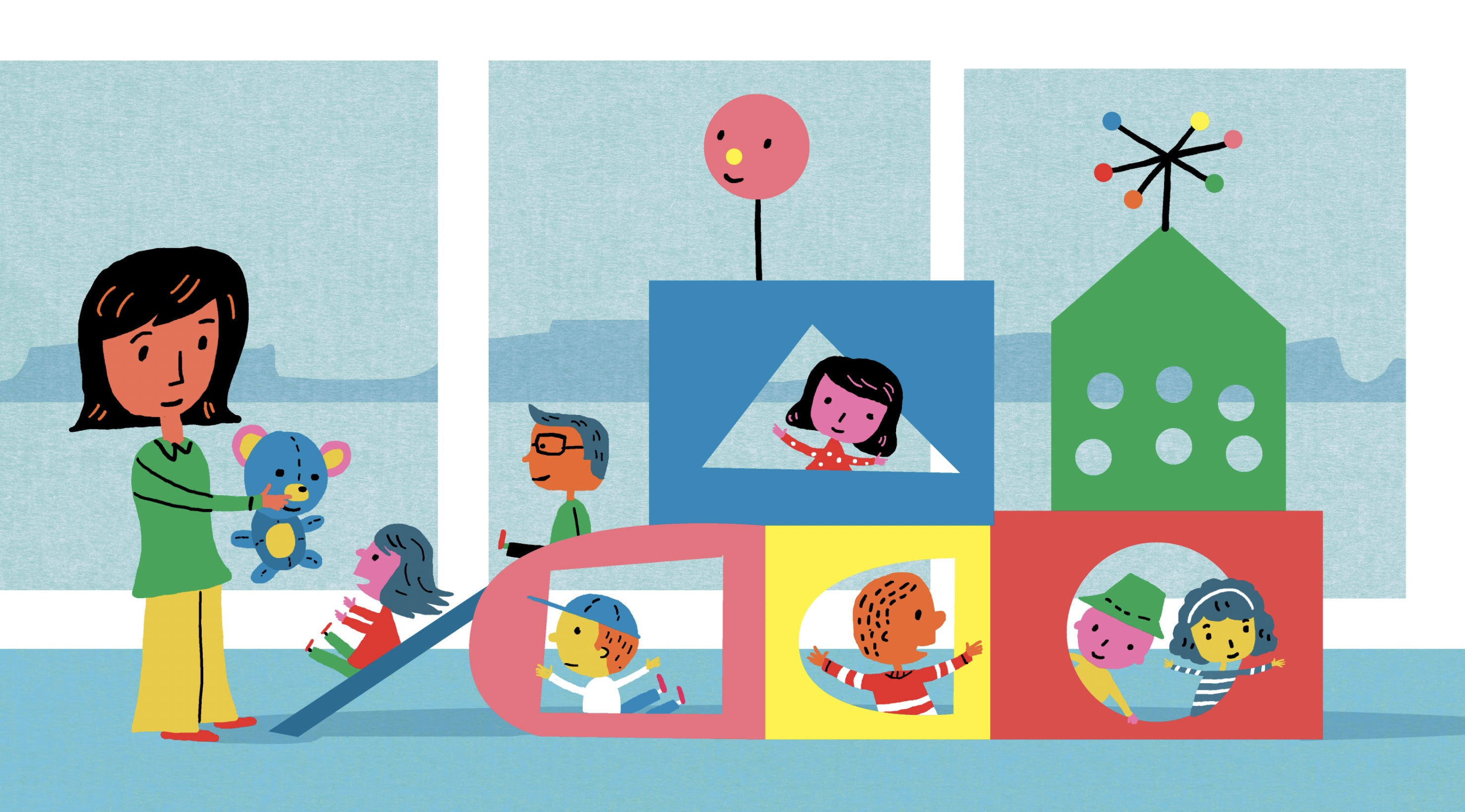
Mae Besom graduated from Sichuan Fine Arts Institute in 2003 and began work as a character designer in Sichuan, China and has been working as a full-time children's illustrator since 2007. Mae uses traditional media, pencil, and watercolor to create texture and light within her enchanting illustrations.

Fernando Juarez has been an independent illustrator since 1997, working mainly with publishing houses and advertising agencies. While Fernando loves to illustrate just about anything, he gets lost in the world of children's book illustration, telling stories with his wonderfully whimsical, engaging characters and narratives. He has also worked alongside animators, bringing their vision to life, most notably, the animated movie, Planet 51.

Gail Armstrong has created paper sculptures for more than 20 years, and her enthusiasm for the medium hasn’t waned one snip. She still wants every image she creates to be better than the last, and this approach has led to plenty of awards, including a Cannes Gold Lion for her Kleenex campaign. She finds inspiration in contemporary art, and not surprisingly, the huge Paperchase outlet on Tottenham Court Road in London. Gail did her foundation course at Sheffield Polytechnic before gaining both a BA and Post Graduate Diploma in graphic design and illustration at Glasgow School of Art. She began her career in graphic design, gradually accepting more and more illustration commissions and perfecting her paper crafting skills.

Caroline Church is a scraperboard artist and the perfect illustrator to approach if you’re after something with a vintage engraved look to it. Based in Twickenham, she grew up in Uganda, where she had pet chameleons and was encouraged to make greetings cards by her mother. Caroline got a BA in illustration at the Chelsea School of Art and then learned wood engraving as a guest student at Royal Academy Schools. Caroline’s style is reminiscent of 19th century engraving, so it tends to lend itself well to projects that aim to convey traditional and time-honored values. Not surprisingly, her main influences include the engravers Thomas Bewick and Gustav Dore.

Born in Lithuania, Ella Tjader studied at the Vilnius School of Economics but later did a graphic design course via the online college, Sessions.edu. That’s how she discovered Adobe Illustrator, and armed with a Wacom tablet she began building up her portfolio while studying the world of illustration and all the magazines, fashion firms, and brands for whom she might be able to work. Feminine, elegant, modern, detailed, intricate, loose, and light, Ella’s style is usually based around line work, though sometimes she’ll use brushes in Photoshop to drop in some vibrant colours. There are lots of organic and intertwining elements in her work to draw in the viewer. She also creates surface designs - seamless patterns and prints.

It’s impossible not to love the comic book style of Arielle Jovellanos. Fresh and light in tone, it’s set to take the graphic novel aesthetic into all sorts of new areas, and Arielle is clearly an artist with a passion for visual storytelling. Arielle graduated from Parsons The New School for Design with a dual degree in illustration and fiction writing in 2014. Most of Arielle’s work is entirely digital – she sketches, draws the lines and colors her images on her Cintiq tablet. Pinks, blues, and purples form her main palette. "Everything is a character" is a piece of advice that guides Arielle’s comic art style. It means she focuses on creating tiny narratives within each image, using body language, facial expression, clothing, and background detail. This builds personality in her work and makes people viewing it wonder what will happen next.

Jack Richardson is an English illustrator in New York, with a clean and fresh comic book style that often features a touch of the unusual. Some of Jack’s main influences include the classic comic artists Alex Toth, Jean Giraud (Mœbius), and Hergé, as well as the painter Daniel Heidkamp and the photographer Robert Adams. With his strong, expressive lines and flat colors, Jack’s style is rooted in the world of hero comics. He strives to bring a narrative to each individual image, and there is often an added layer of meaning, a hint of humour, or something slightly unusual in his work.

Imagination, adventure and emotion are at the heart of Caroline So’s fashion and beauty illustrations, and they’re ingrained in her personality as well. Originally from Southern California, she set off for the Big Apple at 17 with the goal of working in fashion, and she hasn’t looked back since. Now she finds herself producing stylish and elegantly whimsical imagery for the biggest names in fashion and beauty, with a portfolio that’s going from strength to strength. She refers to her pen and paper as her oldest friends, and since she was a child Caroline has been exploring new ways of capturing facial expressions, poses, animals, nature, and more. Caroline has 10 years of experience working as a fashion designer, and that background helps her find the right solutions for her clients with every image she creates. Her inspirations include Francis Bacon and Egon Shiele, and she loves collecting novel perfume bottles, secretly watching reality TV, and backpacking. Favourite destinations include the states of Utah and Arizona, and Florence and Salzburg, and she’s not ruling out Mars as a future stop. Caroline has a bachelor’s degree in fashion design from the Fashion Institute of Technology. Her philosophy has always been to carry on learning new techniques to broaden her skills and style. She continually explores fresh processes and effects, enabling her to impart emotion, energy, and a touch of attitude into her clients' projects. Caroline’s style is bursting with emotion, whimsy, and life. She likes to bring a touch of joy to everything she does, and gives her subjects a sense of playfulness, delicacy, and quirkiness.


