IllustrationX operates on four continents and in eight countries around the world representing a group of illustrators and animators with a depth of style and experience who are ready to take on just about anything.
Latest Additions from IllustrationX
Posted on

Often, custom lettering is just what a project needs to make it unique while at the same time hitting the perfect note with its intended audience. And when a project like that comes along, Ben Tallon’s bespoke hand lettering service Tallon Type should come at the top of your list. Here’s an artist who can tailor the text not just to the campaign, but to each individual communication within it at a level of detail that script typefaces just can’t match.
From tight handwritten styles to headlines in broad brushstrokes, Ben will fine-tune the lettering to the job at hand. He’s spent years evolving a range of character styles, working closely with art directors to gain a comprehensive understanding of kerning, weight, messaging hierarchies, composition, and overlays to make custom lettering as effective as possible. When Ben receives a brief, he often collaborates closely with his client in choosing the media and execution that will give the project maximum impact. Inks, paints, spray paint, pencils, pens, and found materials – the selection depends on the surface, idea, photography and time constraints. Ben creates hand lettering in a variety of styles and will find a look to perfectly suit the mood and tone of the brief. For one project, pen work in a clear hand will convey the right level of subtlety, while others need enormous, bright spray-painted caps. Ben can deliver either, and anything in between.
Growing up in Keighley, West Yorkshire, Ben Tallon loved Leeds United, wrestling, and video games as a child. They still give him inspiration today and sometimes feature in his work, alongside pop icons and TV stars. Now located in London, Ben is passionate about creativity and is the author of Champagne and Wax Crayons, as well as the host of the podcast Arrest All Mimics. He has a BTEC in graphic design from Keighley College, and a BA in illustration from the University of Central Lancashire. Ben uses pens, inks, brushes, found materials and textures, acrylics, spray paint, pastels, wax and coloured pencils – Ben is very much a mixed-media creative. He’ll use worn-out old brushes that have a little more depth and character than new ones and favours the unexpected or happy accident. Photoshop is used to layer everything together and finalise the composition. Ben’s style is loose and organic, full of marks and gaps, because he likes to engage viewers by leaving something to the imagination. Awards: 2015 – Dot London Small Business Awards – Creative Agency of the Year.

Jyotirmayee Patra – Also known as JP – is India’s leading artist for custom lettering, playfully embellished with beautifully rendered flowers, intriguing animals, graphic shapes, and lively textures. Based in Rourkela, JP’s passion for calligraphy led to a career in illustrative lettering, using her talent to imbue her clients’ projects with tone and atmosphere. Botanical drawings and organic patterns are two of her main inspirations, alongside the abstract artist Jessi Raulet. She studied at India’s National Institute of Design in Ahmedabad, learned professional calligraphy from Harvest Crittenden and has taught copperplate calligraphy workshops. JP is a hoarder of unique stationery and pens, loves fairy lights and is a yoga practitioner with an interest in cosmic energy, astral projection and conscious manifestation. “Joining IllustrationWeb was one of my manifestation goals not so long ago, so I believe I have decent manifestation skills!” she says. Everything begins with an inspiring quote, copy relating to the brief, or a central image. After refining her focal point, JP surrounds it with detailed flowers, characters and foliage, playing with the composition until it’s perfectly balanced. JP’s type and illustrations are infused with nature with bold main forms softened by whimsical detail. While her earlier type-based work is black-and-white and emphasizes her rendering skills; her latest images pop with colour. Awards: Winner – INDIAFRICA: A Shared Future Poster Awards – 2012

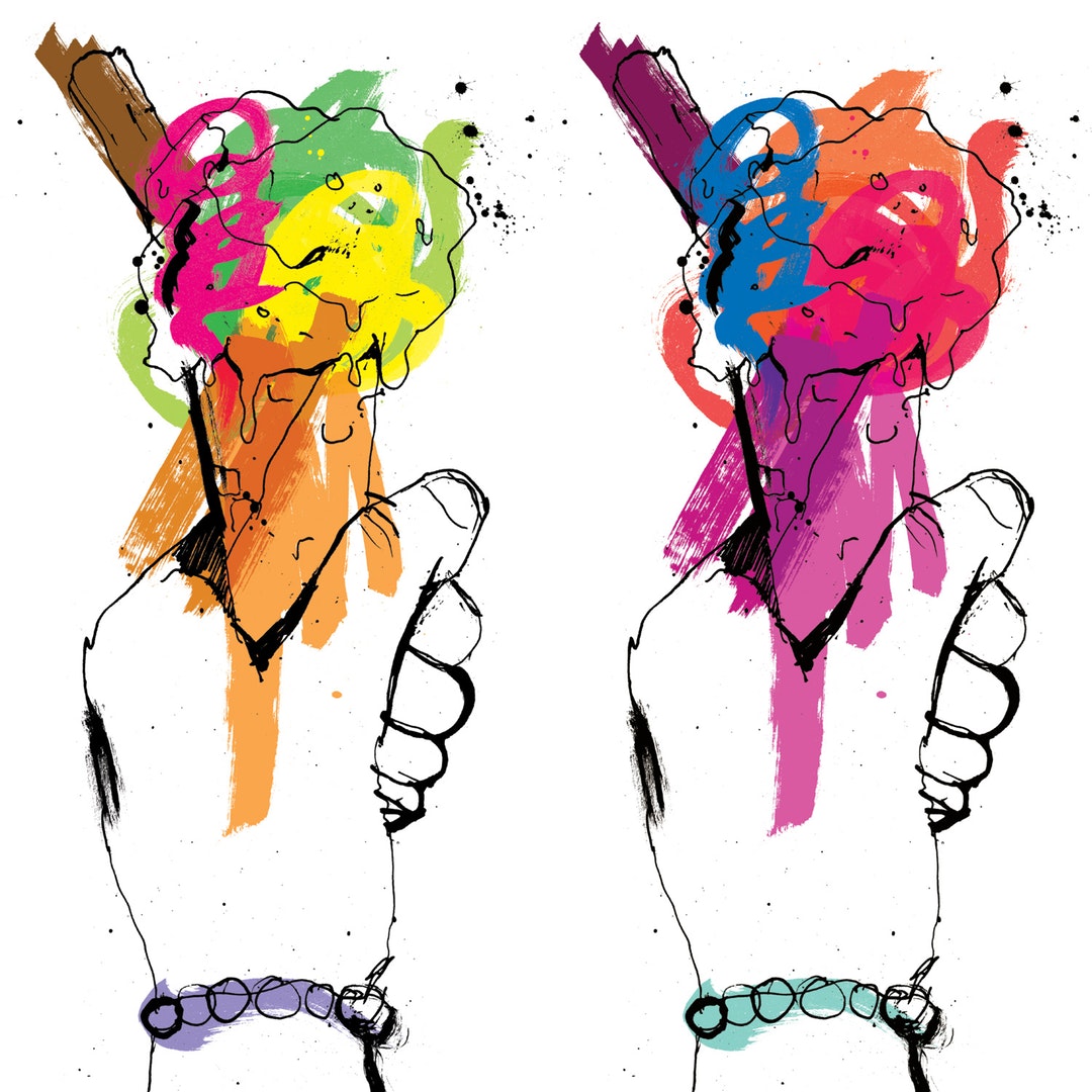
Using a dynamic combination of colour and the 'inspired mark,’ Katharine Asher’s fluid brushwork and creative flare help secure commissions from clients around the globe, in a wide range of sectors. While she specialises in fashion and beauty, Katherine enjoys tackling a wide variety of briefs, applying her expertise, energy and elegance of line.
As well as her illustration work, Kathy creates conceptual art, exploring process works and installations. Pigment, viscosity, and movement are key factors in her art, and occasionally glimmers of her personal work transfer into her illustrations. She has studied graphics, illustration, and fine art. Kathy has a spontaneous and playful approach to a brief, choosing the medium that best suits the job at hand. “One of the joys of working in this way is focusing in the moment, using a triptych of experience, knowledge, and happenstance,” she says. Kathy’s work is often light and minimal, relying on strong lines, deftly applied and mark-making techniques. She uses watercolour and ink, using colour to highlight and accentuate her figurative work rather than to dazzle.

Experienced and versatile, Mark Oliver has a bold, graphical style that is as impactful as it is engaging. His line work, color, and compositional skills are second to none, and his background in advertising means he knows exactly how to meet an art director’s brief with innovative new approaches.
Even when he worked at Alliance International, Mark took the opportunity to illustrate his own ads. With over 20 years under his belt as a freelance illustrator, today he creates imagery for some of the biggest brands and top names in publishing. Now based in Worthing on the South Coast, he’s inspired by Raymond Loewy, Hergé, and Eduardo Paolozzi. Mark has a degree in graphic design from Middlesex University. Mark has used a wide range of media during his career, from physical painting and collage to Illustrator and Photoshop. Most projects these days are tackled digitally, but he loves to draw and paint as well if it suits the commission. Mark works in a variety of styles that he adapts to suit the requirements of a job. His favorite at the moment involves an isometric perspective, geometric shapes, and a distressed finish with a retro palette.